Tuesday, 15 November 2011

Merchant City

Today we took  trip to Glasgow to Examine Merchant City and visit the surrounding retail environment in the surrounding area.
Situated only minutes away from bustle of Glasgow's busiest shopping spots.  We were asked to look at the space itself at how it brands its identity.  First of All we were dropped of right at the courtyard of Merchant City courtyard, there lies a lot of bars, high classed shops and drink emporiums set in period featured buildings. It reminded me of being very italian and upmarket, with the square being italian  commercial restaurants, like Pizza Express and Toni Macaroni and the shops beset that them were such as  Emporio Armani, Cruise and Versace.  It reminds me as a place of Plastic leisure, whether eating out, shopping or going for a drink in a local cocktail bar, people would be flashing the cash- or card.  The walkways were very wide and innovated. And many connected in squares with many dynamic innovated street attached. it seemed very quiet compared to the main street. Most street signs in the sorrounded area had Merchant City below, being still reminded that these street are part of the city, but for someone who is not familiar of the area, i don't think it is well advertised enough in the main street of the town.  There is existing Metal permanent sinage on posts, and overhanging on arches,but with the hustle and bustle of Buchanan Street or Argile Street i feel it could be easily missed, onlookers or tourists.  This may be deliberate. As what appears to be a high classed area they might only want the existing clients to revisit that area, or advertise it to that certain audiences that fits the criteria- upperclass client. 


The Apple Store- Buchanan Street 

From then on we began to study the shops near the  surrounding area.  The first shop we arrived at was The Apple shop, the Historic bank location is hard to miss, full of charachter and heavily listed, it stand proud and tall right in centre of the heart of retail district of Glasgow's  Buchanan street. First thing i noticed was it was very bright and full of natural light, due to the large curved windows.  The colours and materials of the products and apple logo, grey stainless steel, white and black laminated glass panels were followed throughout the sinage and materials that furnished the building. As you first walk through the door on the back wall direct above the products you see their latest product advertised in laminted glass light boxes, in this case the new iphone 4.  These attract you attention straight away and the light against the laminate material makes a strong statement. 
The building it'self is very much open planned with everything in eyesight with lot's of staff surrounding it.   The staff range from all ages and are all dressed informal in the same casual blue t shirts, with the white apple logo printed onto them.  I also noticed there were a multiple number of staff, each ratio for 1 customer in the shop, whom were all wearing some sort of id tags which were aesthetically like ipods.  This gave the impression that they had a good customer service and customers would be able to get  personal assistance, for as long as needed.  The customer could asked lot's of questions and don't have to feel like they are rushed.  Also the fact they are using their products and promoting them in many different approaches, such as the name tag i thought was very clever as a customer would notice that, giving the impression everyone own's an i pod.   
The building itself is a historical and listed building, but they have refurbished it giving it a contemporary and minimal feel.  Each product is displayed on wooden benches alone, with no sinage or price-tag, this means the customer would have to speak to the staff who would persuade the customer to buy.  The fact they are displayed along and the customer can interact with the product gives the impression that the products speak for themselves.  I also noticed that they would attach other devices from apple products for example ipad's into i pods, showing the range of products that can be used together, this is a tactile way called unselling to attract or persuade the customer to buy other accessories that works with the product they are interested in. 


The mezzanine floor, formed as a concrete slab eliminated the need for downstair beams and therefore maximising the headroom space on the sales floor beneath, The statement featured laminated spiral staircase, forming a continuous structural ribbon of glass takes you up to upper level.  There lies the GENUIS BAR, a helpdesk for the software products.  Also all the products advertised on the shelfs in packaging actually have the products in them, usually for security reasons expensive products are kept securely in the back office, but apple feel the need to have their products in they're packaging and have a high level of security.


John Lewis 

Firstly when you enter John Lewis There is a display virtual advertising their website, reminding customers that you can shop online as well as in the department store.  the display carries the renown colours of the John lewis brand, green, black and white.
When you first walk into the store you notice it is very bright, with different stalls selling different brands of produce, each produce has it's own tall display,mainly white, with the names situated on the top of the stalls.  The layout of the space, leads you to many different pathways, and he escalators situated at the back of the shop, making the customer walk round in a circle to access the area that they want.  The toilets and food courts are also situated on the top floor, directing the customer cleverly all through the store.  The bright spotllights are positioned to focused directly on certain items, leading the customers eye around the whole shop, and tall glass display cabinets give distactions on the way through the customers journey. For example at the escalators the customer is looking around, these display cabinets and lighting displays are to attract the customers eye.  
Hanging from the ceiling on each floor and department were green banners advertising a promotion price matching other stores, the colours of the brand are carried througout these, green, white and black.


All saints

The stricking window display of all saints is very eye catching and dynamic.  A repetitive lineal display of sewing machines and the manifesto is then carried through the outside right through to the to the interior.  With large sewing machines exhibited in different areas of the shops.  The shops theme has a very atmospheric industrial and factory aesthetic. Large theatrical spotlights are suspended from the ceiling, which are purposely positioned,emphasising certain areas in the shop, making them a vocal point to the customer. The bold statement clothing, much of which was a range of 4 different colours.  Black, brown, grey and cream.   The style particular cut of the clothing was the main statement of the company.  The designers have particularly targeted their clothes to a small niche market and can be easily identified to from an exterior environment.  Experimental music is played in the shop which may be suited to the buyer.


Tuesday, 8 November 2011

One Day Brief


Our third workshop day was related to our lectures we had the day before. We were shown a video giving examples of how different advertising agencies work as a team.  That day we were assigned a one day brief, in which we were put together from different teams to form one big team.  After we were assigned most of us got together and read the brief.  The aim of the project was to ' Encourage young adult men to visit their Gp's by targeting young women.'  As it is well renowned that men are notoriously bad at visiting the GP and we had to look and research this into more depth and to produce a campaign that would encourage men to attend their Gp's, but our audience would be particularly targeted towards Women.

So got together collectively and decided that that day we would all do some personal research and on the day discuss what we found and compare the research.
I actually had to go to Ninewells ( a local hospital) that night, so with this advantage i took the time to ask the doctor on why he thinks men don't go to the doctor that much and later on went home to look at some statistics online.  When we spoke about it a lot of people did come up with a lot of similar information. Either it was embarrassing for them or some facts such as 'more women get skin cancer than men, but more men die of it'.  Jennifer produced something that was rather interesting and another few people did also.

In the Morning

We all met up in the morning and sat together in a circular desk and listening to what everyone had researched, we collected all this evidence. After the discussion we all went into pairs and each pair went around Dundee with 1 of the 3 research methods we came up with.

Influence chart 

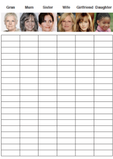
This was one i had been assigned to , the way it worked is we would go around the streets of Dundee City centre and ask men ' which of these women would you take advise from when regarding health advise?  And we would tick the women who they mentioned. it was a quick and easy method and you didn't feel you were hassling people.

Chart Interview.

This was involved questions to men regarding their attitude towards going to the doctors. The strategy was while they were asking these questions, they would get more in depth answers and personal stories.

Body Concerns.

This included a black outline of the male body, women would mark the areas that would worry her most if he were having pain there.  They would approach women on the street and ask them to circle on the outline of the male figurine.  This tool appeared to e useful and the drawing method began to strike conversations with the subject, this  appeared to be a more intimate approach.

I had an interview with a company for my GIDE project, but having a little time i went with My team jennifer and Lynsey around Dundee City with the influence chart asking males what women what influence them.  Most men were cooperative, but i seemed it restricted talking to them more about the subject as it was just one simple question and they would answer and leave because you didn't have their attention for long.  Some of them would associate the celebrity to the women rather than the name.


The Results 
When this was complete we had all arranged to meet a certain time and got together to discuss our morning research results.


It appeared that some of the influence charts are not the results that we predicted.  When people were doing the influence chart we were asking men of different ages and i suppose anyone that would get our attention. we then discussed it may have been better to focus on the age group given. Had we stuck to this and focused on the age group stated in the brief and were contestant in doing so  the results  may have come out differently. (For example most of thee men who mentioned their mum or friend were 18-30. The men who said wife were 35+ and the men over sixty would say their daughter.) This would have been because the stage men were at in their life's, for example a 18-30 year old are very unlikely to say their wife's as most men would not be married.


The group doing the body chart found out that the main areas that women were concerned about were the heart, joints and head areas. And the group doing the questionnaires said that men were more likely to wait until their conditions got serious before they would actually do anything 


Brainstorming And Mind mapping

After brainstorming the main theme that we came up with was that most men were 'embarrased' to go to the doctors or because of 'nagging.' The majority of the group wanted to take these aspects into consideration and go down the humorous route, as looking at our research and we decided this would maybe be more effective to the audience, we also decided  to focus on small ailments, such as coughs and cold or a rashes that would get worse when left untreated.  we felt that featuring serious illnesses such as heart disease or cancer would not be appropriate for the light hearted humorous approach we were aiming for.

We then watched a video on youtube about a wife constantly nagging at her husband, which he kept on ignoring, but it was done in a humorous way not an argumentative way and an element of fun was used  we felt that we would like to use this to our advantage.

One idea that came from this was women looking at a mans symptoms on the NHS website, and he was pretending not to take any notice or not bother. When she walks off he quickly goes to look at the laptop behind her back.  The idea being he does it when she is not looking, as he doesn't her to make a fuss.  Tag line being  '' it does make a difference.''


Afternoon session

After lunch we did some  quick persona's based on our research.

We kept these in mind for our campaign .


We felt that we were all just listening to each other and maybey there was too much talking and not enough drawing, also not everyone could say what they really wanted as some people were more dominant than others. So we decided to draw up some ads that would work for our campaign we all thinking alone the same lines, we wanted a man who was ill and the wife nagging him to go to the doctors, he decided to ignore i and he progressively his symptoms started to get worse.  Our group came up with this ad that we all agreed on, but just developed. In this the wife would leave notes everywhere to remind him to go to the doctors, on her pillow for him to notice when he gets up , on the toothpaste cabinet, written on the steamy shower, on his juice bottle . As the day goes on he progressively gets worse until he ends up back at the cabinet and notices it.


We decided to to combine some ideas together relating back to the girlfriend placing notes everywhere, but also focus on the comedy factor.  It seemed there was a lot of people with different opinions and it took us a while to come up with a final idea.  Some of the illustration students drew up the final product ad the others discussed the advertising pitch and other possible advertising tactile tat would link with our pitch.  We all agreed on a strapline to '' eventually hell get the message.'' which we then later presented in the evening


Sunday, 6 November 2011

Workshop 2 Smash

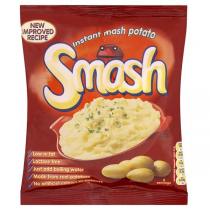
In our second workshop we were given a brief, we had to try and encourage people to try SMASH, the famous instant mash potato in a packet.


Basically '' smash is s dehydrated mash potato.  When boiling water is added it reconstitutes into hot mash that can be served as part of a meal.

We were asked to try it, but i must admit i don't think i could bring myself to eat that. In saying that after this workshop took place i notice it more in shops and thin 'should I?'  Maybe one day.
It also connected with the lectures we were given the day before about market research.  We were given noted about SMASH on for example swot a swat analysis, which i spoke about before in week 1.  We wee put in our teams again and asked to also do some market research on the product, by collecting reactive data which involved connecting peoples attitudes and relationships with food.  Involving looking at the nostalgia, happiness, friendships, memories and experiences, particularly related to food context. We were shown this video in the our lecture the day before. Basically connecting SMash with the idea of it being futuristic, fast and easy to use.  Still healthy and nutritious as it is made of 98% potato and ideal for a family to take on holiday with them.  The robots then get it confiscated cause, giving the impression that the guards want it for themselves it is that good. 


Morning

We all met up at the Dalhousie building on Campus to decide on a stagey of market research to take. We done this rather quickly  We then decided to find out what people's favourite meals were.  We decided a less formal approach would be best and interactive rather than doing a questionnaire, which most people we figured, wouldn't take part in.  So we drew up lots of plates with felt tip pens and asked the public a to draw their favourite meal, we particularly used coloured felt tips, as people are more likely to draw, than write.
We split into groups of two to gain and cover reverent information from different backgrounds.  While they were drawing the food, we noticed we got people's attention more and asked them a series of questions while they were doing it. to gain more evidence.

I suggested Jennifer that we would head down to Magdelin Green ( a local park) as is was a nice day and we figured people would be out socialising and sitting on the grass, which i witnessed the day before as we thought would be easier to appraoch people.  But when we arrived we discovered it was a little early and it would of probably been bet to go at lunchtime.  None the less we spoted a couple of people and more as we walked towards the town.

Here are a few pictures of the people who took part in our exercise.


This Swedish student on the right we both found very interesting.  As he drew up a traditional meal as he drew we began to ask him a series of questions and discovered that he would have in Sweden maybe only once a year a it was very expensive meal that a group of family and friends would eat.  He wasn't sure how to say it in English, but he told us that his uncle would hunt the reindeer, de skin and carve it up for the family.  It obviously meant a lot to him, connecting family and community with the meal.  This type of meal could easily be served with smash, as he said he would have it with potatoes and vegetables.


Most people were co-operate in getting their picture taken, while asking them we also gave them the option to cover their faces as they have felt uncomfortable and then we would still have the evidence when collecting our research.

I also think asking the to draw using felt tips was an effect way as they were more comfortable in doing that rather than being asked a series of questions.  Even though some people were a bit reluctant to draw at first, we mentioned it doesn't have to be a masterpiece to them and that seemed to work.  Using felt tips, people would automatically draw and not write.  These were both useful tips we were told that Lauren Currie's experienced and would use when doing her Service designs.

When people were drawing, we found that is was a good way to get peoples attention more. So we asked them a number of other question's relating to the meal.  For example, who would make the meal?  If it reminded them of anyone, or if it would be eaten on a special occasion.  We got some responses that were repeated like ' mum used to make it' or ' it's not as good as mum's cooking.  Altho we felt that we could have pushed this further and thought about the questions a bit more.  I felt that it was a very effective tool to use and have used it in different ways with other projects.

Afternoon Session.

We all got together in the afternoon, to review and look over each groups results.  We discovered most people decided not to mention SMASH to the public, but  a couple of people did, also a lot of them used pictures or image for our research as a way to communicate with the public.  The group tat did mention it to the public set up a questionnaire, the results were that is was lumpy, watery and didn't taste very nice.  Strangely one woman mentioned they used it as a pizza base and another remembered a old jingle '' for smashed get mashed.' but mentioned that she would never actually buy it.  Another done a questionnaire  and discovered that i wasn't that effective, but offered them chocolates to do it.  This may have tempted people more.  Most people in the class said they would never buy it or try it as they are put of by the fact it is in a packet, even though it was made from 98% potato, then again a lot of them had never tried it, which we all should have really.


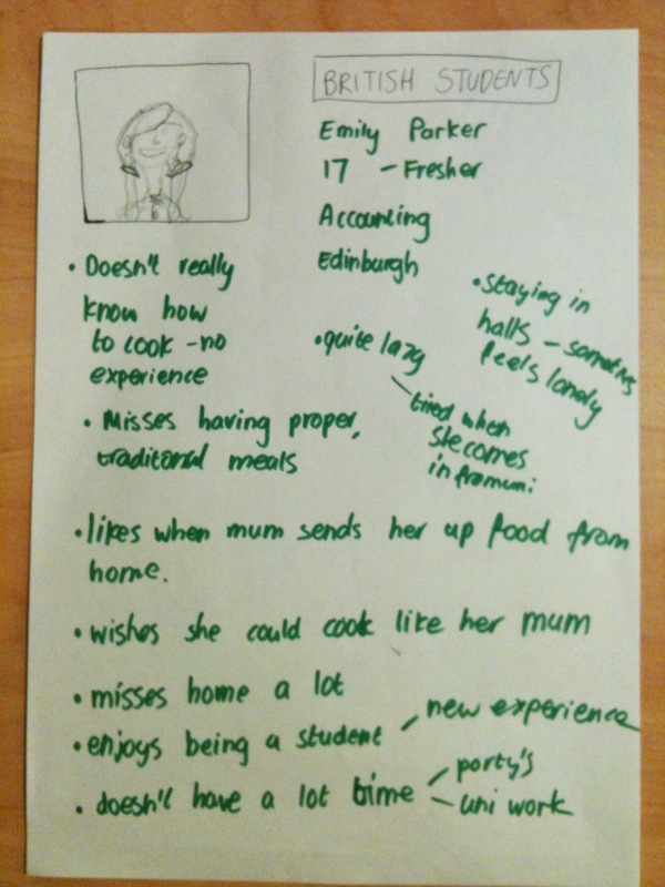
We were then asked to create some personas of people that we might want to target in the market, given one of the lectures mentioning that it is simple but effective way to target small niches, rather than a ramnge of people. Relating back to the 80/20 rule 80% of profit it given by 20% of customers.
For example one of the girls in out team mentioned her parents used to send it to her as it was a quick and easy way for her to cook mash like her mum, again relating back to the comments made earlier that the public suggested. " just like mum'   The persona had to represent a type of person, who would have similar views interests and use the product for similar purposes.

Here are a few examples of Persona's we came up with.


The first one we created was a busy mum, who insist on cooking nutritious food for her children, but doesn't have the time on her hands to cook from scratch all the time.  We decided we would investigate the nutritious properties of SMASH and play on that fact, giving it would be a nutritious and tasty meal and only take half the amount of time to cook if she is already cooking the main part of the meal.  The our lecturer also mentioned that people tend to buy things more when they are instructed to add something, as it would feel they are actually taking part in cooking the food and have some sort of control.  For example saying things like, 'just add water' or 'just add an egg,' It's still giving people the feeling of them cooking, but it's quick and simple.

Tuesday, 11 October 2011

Adverising and Branding week 1

Our first advertising and branding lecture and back to Mr Baldwins lectures, fantastic!!
So what is  a brand exactly? i certainly asked myself that question and  initially thought'Logo' or a 'company name,' eg Apple or Starbucks. These are just the visions of what we see. 'A brand is a collection of functional and emotional values that together promise an experience.'


The diagram shows parts of the elements that make up a brand

The top diagram shows  what people see such as uniforms, packaging and logo.  Basically anything that is visible to the eye, but behind all this is all relevant and promises to provide.


The positioning of these relate to the organisation and what it represents to customer and the competition it has.
The culture of the organisation is everything from the manner it communicates to the customer, or even how they behave are they easy to use? do they arrive on time?

Throughout this module we will be focusing on the production of the visible, by concentrating on the intangibles and looking at how important they are in advertising and branding.

The next day we had our first workshop day,  using the ' the key concept tools' which we learnt yesterday which consist of .


The Marketing mix (the four P's )


The Swat Analysis


Mapping and positioning


The product life Circle


The Ansoff Matrix

We were paired into groups and different teams Team 5 being us and team 6, both had  a variant mix of disciplines.  
Our first task was to choose between one of  three local enterprises and use these tool and strategies to provide a better service that what originally exists, these being The V&A, Canteena in DOJ and the students Union.
My group chose the Catina in Duncan of Jordan Stone, i think cause we know it well and many of us use the existing service daily.  
We initially began by brain storming the strengths and weaknesses of the Canteena and indicate whether these were to do with the service or it's Environment.  From there it gave us an idea of the areas that needed to be improved.


...........next we done perception map to identify the competition that was area already there and plotted them according to the price and quality of food.  The canteen appeared to fall into the low priced and low quality quadrant. (not looking so good really)  So to further our research we used the strengths and weakness to do a SWOT Analysis and created a lists of opportunities and threats.


From these results we came up with two final objectives.


1. This was in relation to the aesthetics of the current Environment and general design of the Space.  We decided a larger scale would be better and by making it more flexible and adaptable to the customers different needs it would increase the volume of customers to the space.  The aims we came up with would be to re open the kitchen and have a healthier variety of different hot and cold foods available to the students.  By dividing the Area into different zones and sections to create a more stimulating and productive Environment.  These zones would have different functions, such as hot desks for people to work around different times.  Also a self service station would case less unnecessary queuing, a area for informal group meetings and many more.  
considering it is art students that use the facilities there is no exhibitions shown or current work from the current students at all, which seems crazy!!!!!!


2.  Was more focused on the current service and improve the turn over it currently receives.  We looked at improving the staff's experience by giving them the relevant training and opportunities to furthermore improve their skills within the service including appraisals and awards in return, this would improve the productivity and input in running the Canteena.  


With both these objectives considered it would provide to a more stimulating and enjoyable experience for both the customers and the staff.


But many groups came up with different objectives which were quite interesting to hear.


In the afternoon it all fell into place what we were doing this for, as it was just a exercise to practise using the tools in place for our next task.   A current upcoming designer, fellow student from DOJ Joanne Montgomery and creater of 'Pillow Talk.'  An innovative product that enables couples mostly in long distance relationships, to fall alsep listening to their partners heartbeat.  This device consist of two components, a flat pannel containing a orb of light and a small device which emits the hearts sound and wraps around the pillow.  The second being a ring, which when worn transmits a signal through wifi to the other persons pillow.  causing it to start glowing and beating.  Joannes aim through her company called http://www.littleriot.co.uk/  aim is to make long distance relationships less screen based eg through skype or facebook, but more intimate.  'Pillow talk'  is all about connecting with your partner in more emotional interactive way.


Soo then we were told to come up with different marketing startegies for this product.  We began by brainstorming and used key concept tool of the 4p's, product, price, place and promotion.  This seemed to be an effective way to identify key markets and strategies and also got us to get to understand how different people worked  in the groups.   


Wednesday, 21 September 2011

The cultures of practise -Advertising and Branding


Week 2


  1. The Consumer and Market Audit
  2. Market Segments
  3. Customer Behaviour
  4. Customer Attributes
  5. Test Your Knowledge
We just had our second lecture on advertising and branding, we learn't that when advertising yourself you firstly need to pick a Market segment and focus on one particular segment rather than target many different as 80% of the Business comes from 20% of the customers, or the 80:20 rule. 
So we were given tasks to way out the rational reason is to why people buy things and irrational reasons, by doing this we had to come up with an advert which would be marketed to a certain audience.

The reason for this is people don't buy what you do, they buy why you do it. 

This made me think of something rather funny i saw in Tescos' the other day when me and my flatmates done our usual one day a week night shop.


                                   Clearly a mistake, but funny none the less!! 
Tescos' advertising that Morrison's Cadburys sachets hot chocolate  are cheaper than them!! 
Wonder how many club card point's you get for spotting that mistake :).

Thursday, 14 April 2011

Assignment 5 :Planning for the future

Activity A


Designing Schools For The Future!!


Introduction


To investigate the current issues in our education system, we first need to define the problem by looking at the common issues which arise in the existing environment. This can be done by observing, analysing and using different service tools and techniques such as ethnography to help identify and define common problems. It is my current role as a designer to research, articulate a clear and actionable proposal, and to help define information and deliverables needed to communicate research findings efficiently to the client.

Research methods

First of all I need to identify the people who can shed light on the question? This would be the students, teachers and staff of the school as they are the main subjects who will be interacting and are heavily involved in the environment. At the start of my process I shall take pictures to observe the school and the students and watch how they interact with their existing space.  I look at the relationship the students and staff have with the building and how they customise their current space to the way they circulate and work.  I will also be looking at what existing equipment is used to help the students learn and interact, and how they adapt that with their learning, taking into consideration how much light is sourced in the building. The pictures will also highlight the needs for the management of the school estate to reflect the values and principles of sustainable development. These pictures will be natural and informal looking at how the current students work is involved in the current community, observing how they get to school and what natural habitats are living locally. Is the school the building or the site? The community neighbourhood or the town? Is it scale define or scale free?  Does it make use of the best resources from the whole place it serves?  Does it exploit a wide range of experiences and subjects in different environments? Whether it be in different classes or environments surrounding the school, covering a range of all ages and staff. Even considering how the local community whether it be shops, libraries or surroundings (if any) communicate and engage with the children.

Mind mapping
Throughout the process I shall takes notes, videos, audios and sketches to help me understand how the students interact with the current school and environment surrounding it. 
Brain storming

The next step would be to find out what the students and teachers want in their future school design. With evidence gathered from beyond casual observation, I will look into detail at how the subjects connect with the existing space by brainstorming or mind mapping the different areas and topics which arise from my first findings.  I will also look at different things I as a designer will want to explore by producing a semi- structural questionnaire to follow as a plan, but deviations can occur to follow up interesting comments in more detail. A range of people within the existing school will be questioned, including teachers from different departments, pupils of all ages and parents. I will record and interview these people to gain a holistic approach. Furthermore I shall hold focus groups in which I will collaborate my subjects by placing them in mixed groups. I will use many different approaches of design tools to turn my original interviews from passive conversation to an active situation.  Through this process I shall encourage the groups to co-design and engage with each other as well as use instruments to communicate, be creative and share insights of their own ideas. The instruments they will use be things such as writing, mind maps, story boards, drawings, sketches and mood boards.  By imagining what might be by previewing the service solution, it makes the future feature more tangible by translating them in visual interpretations or representations as it is important to get staff to share their ideas and get involved as early as possible in the design process.


There has been a new design tool introduced by the Architecture and design Scotland called Spark.  It is a web resource which allows pupils, parents and anyone else who is interested in improving schools to have the opportunity to explore other new school designs and communicate their ideas.  This new tool uses images, videos and downloads, where people can access many interesting examples of recent schools of the future. Spark allows users to create a scrapbook of the different elements of the schools that they like.  This scrap book can then be shared with others in a variety of ways, giving people the opportunity to evolve and communicate their ideas towards the sort of future school designs they would like to see.


spark shows examples of new schools


Before getting to the costly development of a new or improved service, fidelity models are used to prototype and test and ideas quickly and cheaply.  The tools used for service prop typing can go in the direction of mainly evocative simulations, but also give a very realistic description by evolving some of the students ideas and making rough prototypes to answer some of the problems that may arise.  This may involve a group of people in role play, making mock ups of the system, acting out scenarios with hand sketched scenes or may be a case where you design touch points for how a new service might look.
  
I will finally go back to the Ethnology, which highlights the differences in what people perceive is done and what they actually do.  This is carried out by observing what people do as well as listen to what they say.  We learn more about their choices and how they perceive and filter their own actions, and as a result we create environments with peoples real emotions and interactions. With the insights that are generated through ethnologic research and involvement of the whole school organization, our information and visual analysis as a designer can be used to communicate the value of the work and show the possibilities it holds for creating something wonderful. Information that is presented in a visually and compelling way is more likely to be intrigued, inspired and engaged. The use of ethnology and knowledge as a designer can have the ability to make others see and believe. 


Activity B


5 book in which i will read over the summer are 


1.Dr K Fishers pedagogy in space


2. semiotics ( can't remember the title or author my boyfriend has it, but will post it up when i find out)


3. Ethnology: the fundament ethnical problems, the primary ethical groups A.H. Kene


4. Visual communication: from theory to practise by Jonathan Baldwin ( 'hurry on 4 left in stock' amazon

5. Understanding aesthetics ( can't remember the author my boyfriend has it )


5 things i will do to my blog are


1. Change the layout to make it easier to read


2. Write more about my subject and set out a portfolio 


3. Make time even if it's just 15 min to write about things i find that are relevant to my course or design studies.


4. Look into my proposal and think about it more, how can i develop it further or improve it?


5. change the structure and update my personal information, also connect with out followers a lot more.


 5 people i will connect with over summer


1. My friends dad who is a successfull architect.


2  Email design companies for placements.


3. I shall contact other universities for a an exchange in semester 2 next year.


4.  Twitter people from the university to ask what their course involves


5. Twitter  the exectutive for education, to progress my findings for my proposal.